Showing posts with label Lighting. Show all posts

Friday, June 24, 2011

Giddy as a School Girl!

Last post, I told you about this great couple that we are working with! I wanted to update you with some room shots!

Way back when, (day 2 on the job!) one of my first design jobs was selecting and designing the fabrics in the guest bedroom for this couple. They wanted something young, funky, and bright. The husband LOVES orange- so we jumped on the Orange train and went to town!


The bed was the clients and Hank had already selected the remaining furniture for the room. I was able to design the bedding, drapery, and the small side chair. I LOVED this project. I am ecstatic how it turned out!


It turned out to be lively and fresh, just perfect! We are 90% done. All we need are a little accessories, art and these bad boys on the nightstands!!
Tracy Glover Hand-Blown Lamps


Here are a couple of sneaks of the bedding, bench, antelope rug, and mother of pearl wall tile in the master bedroom. It's pretty yummy!


Thursday, January 27, 2011

The Love/Hate Dance

So as a designer, I begin to love something and obsess over it. Then after a year or so, "it" infiltrates the market and everyone loves it too. A few months later, I hate "it" and move on to my next "it" that I love! ha!

Here's what I'm hatin'...

Parson Chairs
I used to love these and wanted them in my house, now they are everywhere, please give me a curve on a chair!


Restoration Hardware

Now don't get me wrong, I still love furniture that looks worn and old. Although it would not work in my house, I like it in small doses. What I don't like is when someone tries to put a room together that looks like an ad for Restoration Hardware...shown above :)


B-O-R-I-N-G-!!!


Granite.. call me crazy but I have never really loved this stuff. I wish it would go away and I hate that it is the "buyer's standard" in home sales. Let's gang up on the world and create a new standard!!


No interesting color or pattern!
All neutral rooms... I admit I was obsessed with this look about a year ago as we were building our house. But I think after a few hard economical years, I just love color and pattern and want to come home to something not boring or super casual. Why shouldn't your home be bright and inviting?


Skinny lamps. I used to love em', now I feel that they just look cheap. Probably just my imagination though.

What are you loving right now in design?


What I'm lovin'...


I love everything about this--the ikat fabric, the bright purple, the small, chrome tray table, minimal accessories, and pink peonies!


Ikat walls, yummy~


Interesting lines on sofas. (This is a Bobby McApline for Lee Industries)


HUGE upholstered headboards,
extra plus if they are in a velvet!


Still loving glass tile, but it has to be interesting! I also love glass lamps, this one is from Tracy Glover!

Art Deco is my ultimate favorite design style, right now.


I can never resist a wow factor in something unexpected!


What are you lovin' and hatin' these days?

Tuesday, November 23, 2010

Office Inspiration

So most of my morning has consisted of me sitting in our temporary office working on bills and getting some Christmas presents painted. I have been day dreaming of getting a new desk and found one at a local store a couple of months ago that I can't get out of my head. The design has snowballed since I found the desk, now if I can just get the funds for the room transformation!

Bonus Room niche: just waiting on trim and carpet.


Right now, we are using our front bedroom for our office while we finish out the bonus room. Once, it's finished, the office area will 
go in the front nook.


 Our walls are Benjamin Moore 212 Happy Valley. We painted with Valspar's flat enamel paint and I love it! It has no sheen; yet, it is very durable and cleanable, not to mention easy to roll on the walls. It has a softer feel than most flat paints, which usually feel rough to the touch. I highly recommend this type of paint!


We are also using Greg's MDF desk from college right now. It's not terrible looking, just not the best quality or look. All the desk's storage is open and makes it look cluttered and messy. He used several plastic drawers for most of his desk stuff, which we are still using. Anyone who knows me knows that doesn't fly with me! So I am looking forward to getting new office furniture where everything has it's own place!


 I apologize for the messy desk, I have been painting and things are all over the place. After seeing this picture up I wonder if I need a Hoarder's intervention? This just gives me MORE motivation to get our new office together so my junk everything has its own place!


Here's my jumping off point: (the picture doesn't do it justice!!)


It looks great and has a thick glass top: just what I have been dreaming of! Let me know if you want one too, I hope to order it in a couple of weeks!


I found this light at West Elm and thought it was the perfect look for the room, but then I found another little beauty in an antique shop yesterday that threw me a curve ball. The new one has a qurky wow factor to it. I also love the pattern on the iron. The best part? It's less than HALF of the price of the West Elm one. Which one do you like?

West Elm lighting
Antique Store find.


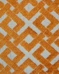
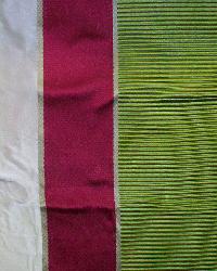
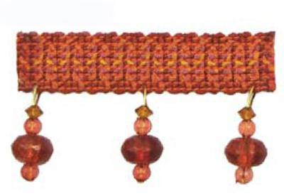
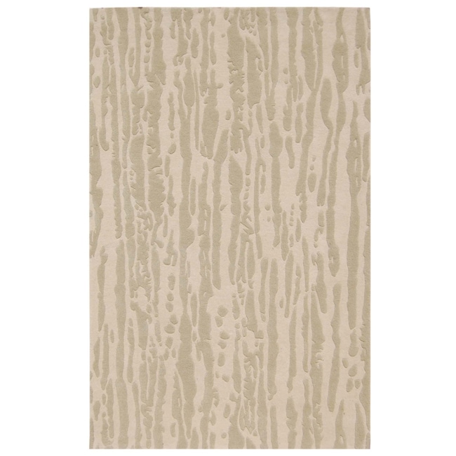
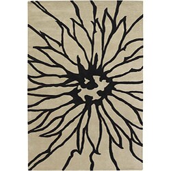
I am perplexed about the rug. I want pattern in the area that is fun and bright, without being too juvenile. I am not sure if I want to get that pattern in my rug or my drapery. I guess it will depend on me going shopping for fabrics and seeing what's out there! Here are some of my rug options that I like so far.


Overstock.com
Overstock.com


The one on the left is simple and has little color to allow for a colorful print on the window and would still work with the tan carpet selected. The one on the right is a bold image without color that would work with a colorful, small patterned fabric on the window and still add to the room's overall feel.


Overstock.com

 Then there's this one. It works with the colors of the room, is a darker color which will hide dirt/stains better, and work with the shape of the Antique light (if I go with that one). I would have to use a simpler window treatment than I originally planned, but it might be worth it!


"Whitney, what about storage?" you say? Well here's what I'm thinking: built-ins, possibly a project for hubby and me. On each side of the niche are half walls and just adding long, short cubbies and drawers would be perfect.  Here's my quick photoshop of everything in the room.


I am sure that colors of the built-ins/drapery might change. This looks a bit too matchy-matchy for me, but it's getting there.


If this was yours, how would you decorate it?

Wednesday, November 10, 2010

Color me Longwood!

Here are some photos of the room along the way... Tile work is supposed to begin sometime this week and I will post more pictures after they start tile work.

WEEK 2:

The Hallway into the bath with doors and walls removed.

Tub and the vanity wall removed.

New shower cavity and toilet niche.

Toilet Niche

 WEEK 3:
Tub surround and bench installed. Quartz countertops installed and tub in place.

New half-wall installed and new counter tops installed.

Shower cavity and toilet niche. Plumbing being installed.


Now the fun stuff~

One thing that I love to do for clients is to draw a color rendering of the space. This allows them to see everything together and understand the overall feel of the room. My first rendering I did for these clients allowed us to start a dialogue and adjust the design to better fit their needs. Here is the final color rendering of the new design.


Our design process began through looking through millions upon millions of magazines for inspiration. We narrowed our inspiration pictures and began building a design. Tons of ideas were rolling around and the client had a hard time committing to a design scheme, so we started looking at tiles. On the first day, we found the absolute perfect accent tile for the room and our inspiration for the room was born. It was a gorgeous glass tile with many color variations and a glaze over it that made more a transitional than modern feel.

Glass accent tile.
After this selection, everything fell into place. We found a wall tile that we LOVED for the shower and tub front. It had great movement while subtle color variations to keep the style "spa-like" and airy.
Shower Wall and Tub Front Tile.
With so much color being in the accent tile and having a very neutral shower tile, we decided to go bold on the floor and bring the design together with the color. The porcelain tile that we found was perfect! It was full color and life and even had the same glazed look as the accent tile.
Bathroom and Shower Flooring.
Our biggest obstacle was finding the counter top. We first looked at granites and natural stones. The client loved the look of marble and limestone, but did not want the up-keep of a natural stone. Our next stop was quartz. After several trips and options, we found one that was beautiful and fit the design of the room perfectly!

Champagne Limestone Quartz
Picking out lighting was so much fun. There are so many finishes and options out there these days! We ended up finding a great line that had the best shapes and finish options that was a blend of the transitional feel of the bathroom and the traditional feel of the rest of the home.


Chandelier and Vanity Lights ( Will be a dark brushed nickel finish)


The room is coming together fast! Check back in a couple of days and I hope to have new progress pictures up for you to see!